Friday, December 10, 2010
Monday, December 6, 2010
Wednesday, December 1, 2010
Wednesday, November 10, 2010
Personal Logo
My company name is Archer Design. I chose the colors and over all design to remain simple. The arrow is hitting the bulls-eye to show that my company always hits its target.
Tuesday, October 26, 2010
Self Portrait
 | |
| I chose the color to resemble dawn. I know have the abilities to do much but I do not have the skills to create what I want. |
Tuesday, October 19, 2010
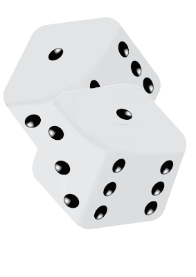
Dice
 |
| I chose the dice for the picture project. |
It took me a long time to make them because for some reason they were always partly transparent.
For those who feel like they know the reason, opacity was default and set to 100% and they were still see-through.
Thursday, October 14, 2010
Tuesday, October 12, 2010
Flower
 |
| Here's my flower. If you're curious, I set the opacity to 50% to get the look. I just noticed this. It's only on the blog, but the flower also kind of looks like a star. |
Thursday, October 7, 2010
Friday, October 1, 2010
Thursday, September 30, 2010
Friday, September 24, 2010
Wednesday, September 22, 2010
Tuesday, September 14, 2010
Friday, September 10, 2010
Quote

I chose this quote because it is a fact that most people deny. I completely agree and I say that "Religion, like all superstitions, is used to explain what we don't know or understand. Science is used understand what we don't know."-Miles Love(Yes, I made that up my self). That's just my opinion. I enlarged some words, sometimes letter by letter in the word. I also colored the words of particular importance.
Monday, September 6, 2010
Design Elements
The steady brightening or darkening of the color of the mountains and changing size of the trees give a sense of depth and perspective and a sense of proportion. The horizontal lines give a sense of calmness and balance. There is also an implied texture from the trees on the mountains.
Over all it's very geometric. The large amount of implied circles and lines (I'm not counting them) and the variety of colors create chaos. The diagonal and parallel lines and arcs and repetition of the circles give a sense of movement and order to the disorder.
P.S. There are 2 actual circles with no partial overlap or change in color.
Miles Love My Bio
I have one brother. I play the violin. My family drove to Alaska this summer. I will be in Robotics Club when it starts. I went to Norway three times. I am very good at math. I can program some. I do not like talking about my self and I am not very good.
Subscribe to:
Comments (Atom)


